A printer’s quote lists “typesetting” as a separate line. A self-publishing platform asks for a properly typeset interior file. So what is typesetting, and why does it get its own line? Typesetting is the work of turning final, approved text into finished pages: setting the type, controlling the space between letters, words and lines, deciding where lines and pages break, and making headings, tables and notes fall where they should. When it is done well, nobody notices it – the page is simply easy to read. When it is done badly, a document looks homemade even when the writing and the design are good. This guide explains what typesetting covers, how it differs from typography and layout, which tools typesetters use, and what changes when the same text is set in several languages.
What Is Typesetting?
Typesetting is the arrangement of text into its final form for print or screen. For centuries the word was literal: a compositor set pieces of metal type, letter by letter, into lines. Today the type is digital, but the job is the same – take text that is already written, edited and approved, and set it on the page so that it is clear, consistent and easy to read. A typesetter is the person who does this work; the word has also long been used for the machines that set type.
Compare an untypeset page with a typeset one. The untypeset version is text poured onto a page: uneven gaps between words, a heading stranded at the foot of a page, a table split without its header row, one line of a paragraph alone at the top of the next page. The typeset version holds the same words, but the spacing is even, headings stay with their text, tables carry their headers over, and every page follows the same grid and styles.
Typesetting is one of the last production steps before a document is printed or published. It comes after writing, editing and translation, and after the design – the look of the page – is settled. For documents produced in several languages, the same work is repeated for every language version, as our guide to what multilingual DTP involves explains.
From Metal Type to Software
For most of printing history, typesetting was done by hand. From Gutenberg’s time in the mid-15th century, a compositor picked individual metal letters from a type case and set them side by side in a composing stick, adding spaces until each line was justified.
The first successful typesetting machines arrived in the 1880s. The Linotype, patented by Ottmar Mergenthaler in 1884, cast a complete line of type in one piece from brass matrices selected at a keyboard. The Monotype, patented by Tolbert Lanston in 1885, split the job in two: its keyboard punched a paper ribbon, and a separate caster read the ribbon and cast the characters one by one.
From the 1950s, phototypesetting began to replace metal with light: machines such as the Linofilm and the Monophoto produced images of the characters on light-sensitive film or paper, and in the 1960s computers began to drive the work. Desktop publishing followed in 1985, when Aldus PageMaker, the Apple LaserWriter and Adobe’s PostScript brought page layout to the Macintosh. Today typesetting happens in software, but the decisions a compositor once made by hand are still the core of the job.
What a Typesetter Actually Controls
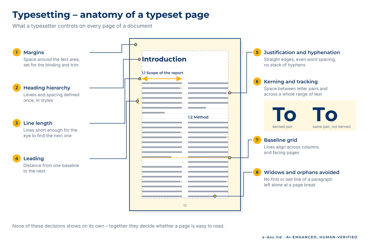
A typeset page is the sum of many small decisions. These are the ones a typesetter makes, or checks, in every document:
- Typeface and size. The font family, weights and sizes for body text, headings, captions and notes – defined once in styles.
- Leading. The vertical distance from one baseline to the next. Too tight, and lines crowd each other; too loose, and the paragraph falls apart.
- Line length. How many characters fit on a line. Lines that are too long make the eye lose its place; lines that are too short chop the text into fragments.
- Alignment and justification. Left-aligned text keeps word spacing even. Justified text gets straight edges on both sides by stretching or squeezing the spaces – the source of the white “rivers” in badly set columns.
- Hyphenation. Breaking words at line ends evens out the spacing, but a stack of hyphens or a break in the wrong place distracts the reader. The rules follow the language of the text.
- Kerning and tracking. Kerning adjusts the space between specific pairs of letters, such as “To” or “Wa”; tracking loosens or tightens the spacing of a whole range of text.
- Widows and orphans. The first or last line of a paragraph left alone at the bottom or top of a page or column.
- Heading hierarchy and styles. Clear heading levels with consistent spacing, applied through paragraph and character styles rather than by hand.
- Grids and margins. Margins, columns and often a baseline grid that keeps lines aligned across columns and facing pages.
- Tables, footnotes, formulas and special characters. Tables that break cleanly across pages, footnotes on the same page as their references, mathematical expressions, symbols, and non-breaking spaces that keep a number with its unit.
Then there is the paragraph as a whole. InDesign’s default Adobe Paragraph Composer evaluates all the lines of a paragraph together and can adjust earlier lines to avoid a poor break later, for more even spacing and fewer hyphens; the Adobe Single-line Composer sets one line at a time, which suits headlines and short text. Adobe’s help page on setting text composition in InDesign explains both.
Typesetting vs Typography vs Layout vs DTP
These four terms overlap, and quotes and job descriptions often use them loosely. In practice, they usually mean this:
| Term | What it covers | Who usually does it | When it happens |
|---|---|---|---|
| Typography | The design of type and of the rules for using it: which typefaces, sizes, weights and spacing a brand or publication uses | Type designers and graphic designers | When a brand, a template or a series design is created |
| Layout | The arrangement of everything on the page: text areas, images, white space, the grid and the order in which the eye moves | Graphic designers | When the design of a document or template is made |
| Typesetting | Setting the actual, final text into that design: styles applied, spacing, hyphenation, line and page breaks, tables and notes | Typesetters and DTP specialists | After the text is final, before print or publication |
| DTP (desktop publishing) | Producing documents on a computer with page layout software: layout and typesetting together, plus images, fonts and the final print or digital files | DTP specialists | Throughout production, up to the final files |
So when a quote lists design and typesetting separately, design usually means creating the look and the templates, and typesetting means fitting your final text into them, page by page.
Typesetting Tools: From InDesign to LaTeX
The right tool depends on the document:
- InDesign. Adobe InDesign is page layout software built for designed documents: brochures, reports, manuals, catalogs and books. Typesetting there runs on paragraph and character styles, baseline grids, and hyphenation and justification (H&J) settings, and InDesign can highlight problems on screen – lines that break those settings, substituted fonts – which makes checking a long document systematic. If only the PDF of an old layout survives, see our guide to rebuilding a PDF as an InDesign file.
- TeX and LaTeX. TeX is a typesetting system by Donald E. Knuth, who developed its first version in 1978 for the creation of beautiful books, especially books with a lot of mathematics. LaTeX, a document preparation system built on TeX, is most often used for technical and scientific documents: the author writes plain text with markup commands, and the system sets the pages, formulas included.
- Word. Microsoft Word is a word processor, not a page layout program, but it has real typesetting features: styles, automatic hyphenation, and widow and orphan control, which is on by default. For a contract or an internal report that stays in Word, careful styles are often enough. In our experience, the limits show in print production: Word is built around one flow of text rather than frames on a designer’s grid, and its page setup has no bleed setting, so files for a commercial printer or a book platform need extra steps or layout software.
- Ebooks. A reflowable EPUB adapts its text to each device, so line and page breaks change from screen to screen and the typesetting work goes into clean structure and consistent styles. A fixed-layout EPUB keeps its designed pages and is typeset much like print.
Which file to send for each of these is covered in our guide to which DTP file formats to send.
Need a document typeset properly?
We typeset your finalized text in InDesign – reports, brochures, manuals and books, in one language or many – with correct fonts and text direction at layout level, and deliver print-ready or digital files.
Typesetting in More Than One Language
Everything above is decided once for the source language – and again for every translation, because the text changes shape:
- Length. Translations into many languages run longer than English, so frames, tables and pages that fit the source overflow – see how much translated text grows.
- Fonts. A brand font that covers English may have no Greek, Cyrillic or Vietnamese characters, let alone Arabic or Chinese. Each version needs a font that covers its characters and still fits the design.
- Direction. Arabic and Hebrew run right to left, which changes paragraph direction and alignment and often mirrors parts of the layout. We set correct fonts and text direction at layout level – our guide to laying out Arabic and other right-to-left text explains what that involves.
- Line breaks. Hyphenation follows the dictionary of the language assigned to the text, so every style in every version needs the right language. Japanese breaks lines between characters rather than at spaces, with exceptions for certain punctuation marks and small kana, as W3C documents in its Requirements for Japanese Text Layout.
- The round trip. When the layout lives in InDesign, the text usually travels through translation in an IDML file, so translators work on the text without touching the layout – see how IDML carries a layout through translation.
- The final check. Typesetting a language and judging it are different skills. For Arabic, Hebrew, Chinese, Japanese, Korean and Indic scripts, the final linguistic sign-off stays with the client’s reviewer – a step our post-translation DTP workflow builds in.
Typesetting a Book vs a Business Document
The same principles apply to both, but the work looks different.
A book interior follows conventions of its own: front matter such as the title page, copyright page and contents; running heads and page numbers; chapter openings; balanced facing pages; and a trim size, margins and gutter chosen for the binding. Self-publishing platforms add their own file requirements. IngramSpark’s File Creation Guide, for example, asks for one interior PDF with all fonts embedded, for images that run to the edge, a bleed of 0.125 inches (3 mm) on the top, bottom and outside edges, and recommends keeping text at least 0.5 inches (13 mm) from the trim; KDP also asks for the fonts to be embedded. Our page for authors and publishers covers how we prepare book interiors and ebooks.
A business document – a report, a brochure, a manual, a catalog – is built around a brand template instead. The work lies in styles that many authors and updates must follow, legible tables and charts, footnotes and cross-references, and consistent output across a series. If the document stays in Word, the job is document formatting; if it goes to print or carries a designed layout, it is typeset in page layout software.
When to Hand Typesetting to a Professional
Plenty of documents never need a typesetter – a letter or a short memo is fine in Word with sensible styles. The work outgrows a do-it-yourself approach when:
- A print date is fixed. Typesetting comes at the end of production, so every earlier delay eats into its time.
- The document is long and structured. Tables across pages, footnotes, cross-references and formulas multiply the decisions on every page.
- There are several language versions. Each needs its own fitting, fonts and layout checks – and the versions have to match.
- A platform or a printer sets file requirements. Trim, bleed, margins, embedded fonts and PDF settings have to be right before upload.
- Many people work from one brand template. Consistency across a series depends on styles that someone owns and maintains.
None of these means a document cannot be typeset in-house. It means the typesetting needs an owner with the time and the tools – inside your team or outside it.
Frequently Asked Questions
What does a typesetter do?
A typesetter takes final, approved text and sets it into pages: applies the styles of the design, controls spacing, hyphenation and line and page breaks, fits tables, notes and images, and prepares the print or digital files. In multilingual work, that happens for every language version.
Is typesetting the same as typography?
No. Typography is the design of type and of the rules for using it – which typefaces, sizes and spacing a publication uses. Typesetting applies those rules to a specific text, page by page. A typographer decides how headings should look; a typesetter makes every heading in the document follow that decision.
Can I typeset a document in Word?
For many documents, yes: Word has styles, automatic hyphenation and widow and orphan control. For designed layouts and commercial print, page layout software such as InDesign gives more control over spacing, grids and output.
What software do professional typesetters use?
Page layout software such as Adobe InDesign for designed documents and books, and typesetting systems such as TeX and LaTeX for mathematical and scientific texts. Our team typesets in InDesign, uses Illustrator, Photoshop and Acrobat for graphics and PDF output, and works in Word, PowerPoint and Excel when a document stays in Office.
What is LaTeX typesetting?
LaTeX is a document preparation system built on TeX, the typesetting system Donald E. Knuth created for beautiful books, especially books with a lot of mathematics. The author writes the text with markup commands, and LaTeX sets the pages, formulas included. It is most often used for technical and scientific documents.
Does a typesetter edit the text?
No. Typesetting works from final, approved text: editing comes before it, and checking the typeset pages is a separate stage after it, done by the author or the editor. A typesetter checks the layout – spacing, breaks, fonts and consistency – but does not change the wording.
Do ebooks need typesetting?
Yes, but a different kind. In a reflowable ebook, the reading device decides where lines and pages break, so the work goes into clean structure and consistent styles. A fixed-layout ebook keeps its designed pages and is typeset much like print.
So what is typesetting? It is the part of document production nobody sees when it is done well: even spacing, clean breaks, consistent styles and pages that are easy to read – in every language the document is published in. Settle the text first, choose the tool that fits the document and give the typesetting an owner – then your report, manual or book will look as carefully made as the words in it.